Digital painting exercises: 7 helpful exercises to improve your Digital Painting (Part 2). In the early days of getting used to Digital Painting, it’s hard to stop us from drawing anything that is now dreaming in mind, right? I kept drawing hard, but then the “finished product” was worse than I thought, but I still kept drawing and passionate!
Sometimes you will also think about practicing seriously before you start drawing a serious digital painting -digital painting exercises . But the basics are really boring! Who would rather draw a dragon than go and polish the blocks!
I understand that. Therefore, I have set up a series of exercises that will help you learn without having to draw boring things (like square boxes, figurines …). Draw whatever you like with the following drawing techniques, you will find yourself improving in no time!
(Cont’d)
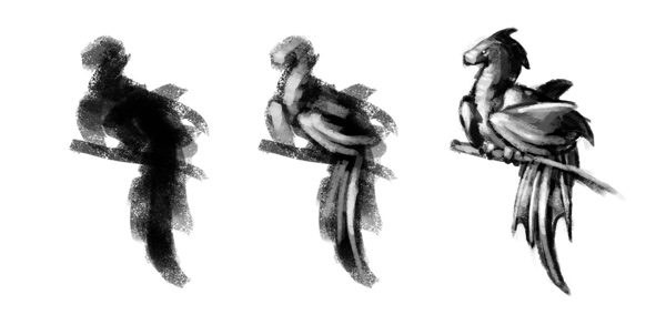
4. Paint with the big head brush
We learn to draw or more specifically digital painting to express what we think. But no matter how complete the images in your head are, exporting them to paper is a long, sequential process. And this creates an annoying problem. If I wanted to draw an epic dragon, where should I start? Draw wings or draw eyes first? What about the scales? When should I color? We are often dominated by small details, then fall into the “trimming” but forget the whole picture.
The solution to this problem is to adjust the detail density. First you draw a large shape (the whole shape) with very little detail, then you go deep into a smaller area with just the right details, then go deeper (more detail). This allows you to spread the whole picture evenly and avoid the dragon being extremely detailed in the head, but the lower legs have a few sketches.
So when starting your drawing, don’t waste time choosing a brush, just choose a big one, set the tip of the brush really big (to limit detail trimming) and draw!
This exercise is quite short. Just from now on, get in the habit of starting your pictures with a large head brush. Use it to form the big picture, and it doesn’t take long so if you don’t like it, you can make quick edits or draw something else. This method gives you an opportunity to get a good overview before investing your time into details.
5. Light up and dark without direct light
When you first learn about shadows and lighting, you usually start by choosing a directional light source, then starting to lighten and darken the object. In practice, however, you will find that objects are seldom illuminated by a single source of light in a distinct direction. Real objects are often enveloped in “ignorant” light, the kind of light that comes from all sides, reflected and “shaken” by everything, giving the feeling of a space where light everywhere.
If you want to lighten and darken objects in a natural, real-life way, you have to master this method. Actually it’s pretty simple once you get it.
To practice this exercise, you need to know a simple rule. We usually light and dark for an object with two light sources: the primary light source and the reflective source. Everything else is the shadow.


This bird was flying in the dark, illustrated by a strong light coming from a single direction.
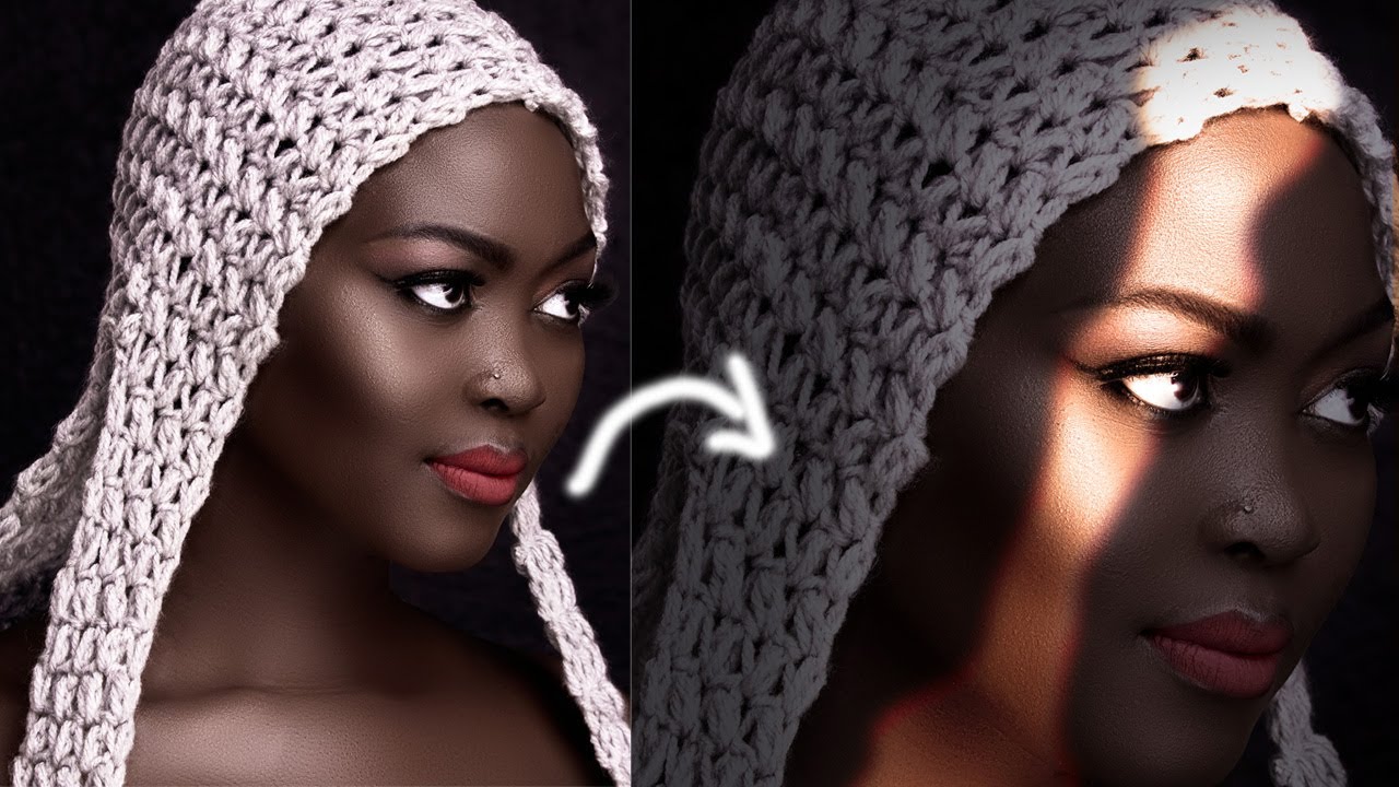
Another way to make the image look more “real” is to … lighten and darken before choosing a light source. To do so, slightly increase the shade of the shadow color and use that color to paint areas without sticking to the line.


This bird was drawn not only by a primary light source, but also by a space light coming from the sky.
If you understand and apply it correctly, your lightened and darkened object will look more like the second result (see image below).

If you’re still a bit vague, here’s a quick summary: Before you start darkening the traditional way, try to visualize a hidden light source surrounding the entire object. Only when you have this consciousness do you start to lighten and darken. This method will leave your painting out of harsh contrast, but will make the painting softer and more realistic.
6. Research before drawing
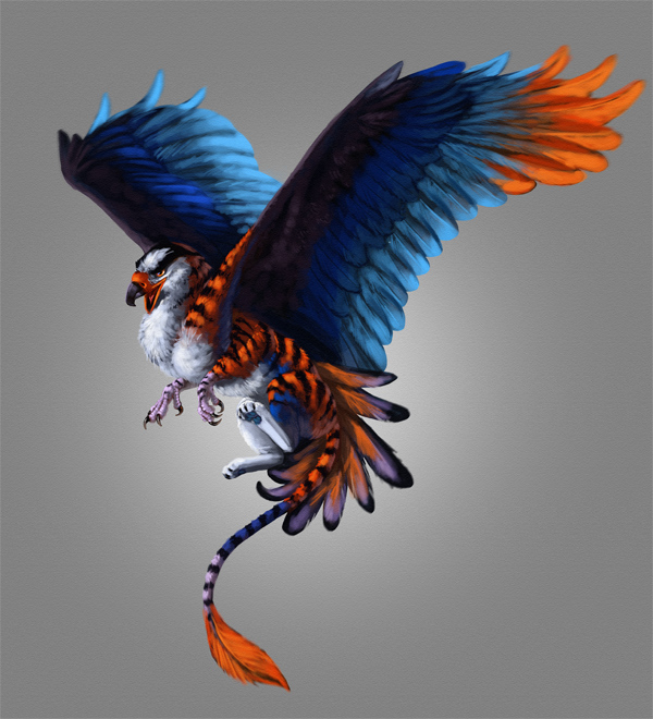
“Oh, this is an interesting bird, I will use its amazing colors to draw a Griffin (the head of a bird).” You open Photoshop and … Stop it! Wait for it. Ask yourself: Have I ever drawn a bird, or a lion? Griffin may be a fictional creature, but every part of its body is made up of real beasts. You cannot just draw something and convince the viewer that it is a Griffin, if its head doesn’t look like a bird and its body doesn’t look like a lion.
If you’ve never drawn something, don’t expect to get it right the first time. If you’ve never spent time observing the object, you probably won’t be able to draw it.
Going back to the original example, before drawing the Griffin, try this test before getting to work. Sketch a bird’s wing or a lion’s leg. If it is easy enough, then you can start drawing your griffin. And if it’s too difficult? No problem, you just saved yourself hours of drawing a picture that you cannot draw properly.

Do this exercise every time you are about to draw a new idea. Find the elements that make up the picture, sketch them out individually. If you feel good, feel free to continue drawing. If not, you should find more material and practice a lot before drawing the main drawing.
And not only that, this method is also applicable to tests of lighting, color, layout. Draft and test before you get started, don’t let your future masterpiece spoil just by not being well prepared at first.

7. Learn to master shades
By starting the drawing in greyscale (black and white) first and then color correction later, your work can be smoother and less tangled. However it can make you forget the most important part of the composition – the value.
Colors have its own luminosity, but they also have different hue values - the brightest blue, for example, always looks darker than the brightest yellow. Here, I would like to present to you an exercise that you can incorporate into common drawings.
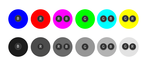
If you switch the color ring to greyscale, it should look like this:

It may seem confusing at first, but you just need to understand that green will turn into light gray (close to white), red for medium gray and blue for dark gray (close to black). The other colors are a blend of the three colors above, which turns out to be a blend of the three main shades of gray on the greyscale ring, so it’s pretty easy to “weigh” them.

Why is this so important? As an example, you just drew this bird in black and white:

And now you want to color it like this:

So you start painting these colors on different layers, then change its blend mode to Color. And this happens:

Why? Because the colors added to the shading layers carry no hue information. For example, the blue color of the highlights is brightened by reducing the saturation. The result is a brighter blue, just not what you want, because Photoshop can’t read your mind!
To fix this, before adding color to the canvas, pre-fill an all gray layer and set it to multiply. Use dark gray instead of blue, light gray for green, …

At this point, when you add more colors, everything will be more your way:

The best part about mastering the color scheme is that it helps you to pre-set the interaction between colors. Our eyes look for contrast first, and color is therefore less important. No matter how vibrant your drawing is, if you deal with the wrong colors, the work will still fail to impress the viewer.
Chroma isn’t the only important factor when you’re painting in greyscale mode – and even when you’re painting at the color temperature, you still have to pay attention to the four hidden elements: the value. color (hue), freshness / re (saturation) and brightness (Brightness). Remember, your eyes not only see “green” or “yellow”, but also “light” and “dark”!

Just like that!
I hope these exercises will help speed your progress!
Follow more useful author’s instructions at https://twitter.com/mzagrobelna
Author: Monika Zagraobelna
7 helpful exercises to improve your Digital Painting (part 1)
SEE MORE POSTS in this category https://theartcult.net/category/arts/photoshop/


