In the early days of getting used to Digital Painting, it’s hard to stop us from drawing anything that is now dreaming in mind, right? I kept drawing hard, but then the “finished product” was worse than I thought, but I still kept drawing and passionate!
Sometimes you will also think about practicing seriously before you start drawing a serious digital painting . But the basics are really boring! Who would rather draw a dragon than go and polish the blocks!
I understand that. Therefore, I have set up a series of exercises that will help you learn without having to draw boring things (like square boxes, figurines …). Draw whatever you like with the following drawing techniques, you will find yourself improving in no time!
1. Paint only the bright parts
Most of us usually “default” paint on a white background, but that is just an old remnant of traditional art. This default forces us to “draw” both the highlights and shadows, although the shadow is not really anything at all terrible – it’s just the lack of light.
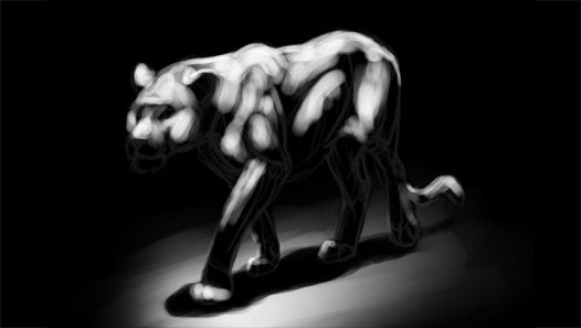
With the beginning of the painting on a BLACK background, you force yourself to paint with only the bright parts, the shadow automatically becomes its natural concept: areas with no light.
Step 1
Sketch the image you want to draw.

Step 2
Make a negative of the sketch. If using Photoshop you can use Ctrl + I key combination. Blacken the background by selecting the background layer and then fill it with black.

Step 3
Reduce the Opacity of the sketch, the more blurred the better.

Step 4
This is when the fun begins! Identify patches of light, predict where the light will hit the surface of an object, and then whiten those spots.
Step 5
The main light source will bounce off the ground, so it creates a weaker secondary light that bounces off the object’s lower surface (called a bounce). Use gray to represent these highlights.

Step 6
That’s it! At this point you can stop, or trim the details for more perfection. You can use it as a shadow layer for another color layer to create a real painting. (choose Multiply mode).

2. Restrict your color set
The color palette in Photoshop can be dizzying with its options. And often you will be confused when you have to choose between yellow or greenish yellow, because the truth is they are almost the same.
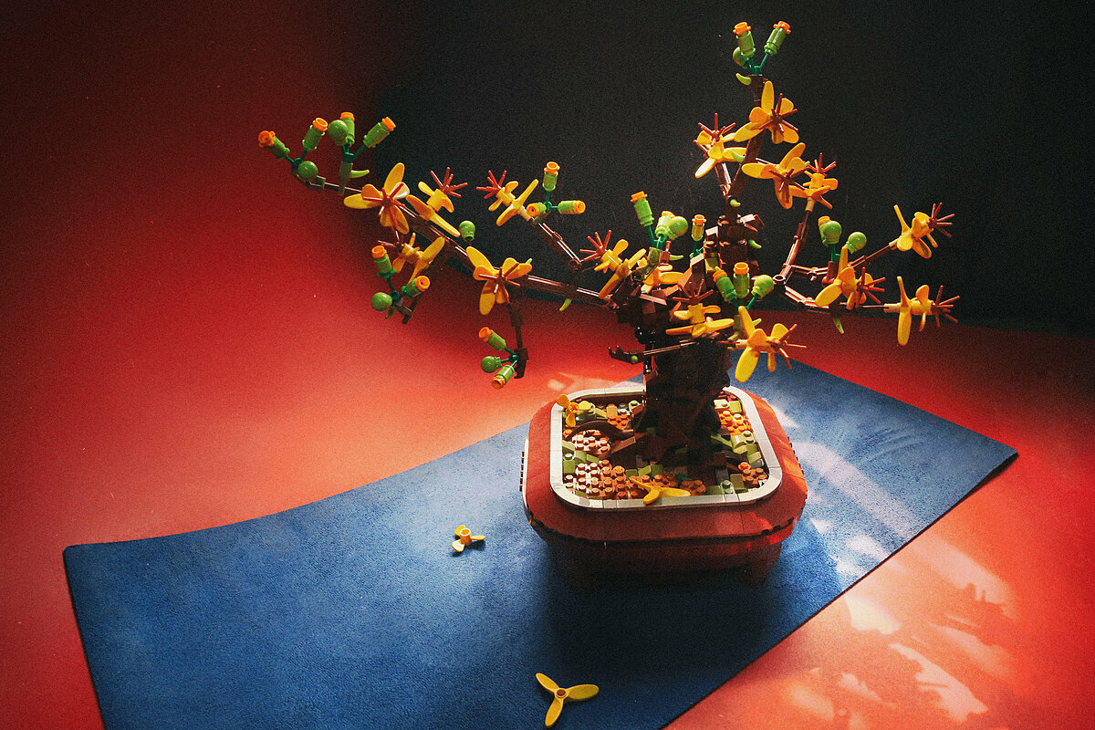
The reality is that almost every object has a limited color gamut, typically 2 to 3 primary colors, and only 1 or 2 sub-colors for fine details. If you use too many colors to paint, your drawing may look “barren”, look fake (not like the pattern). To avoid wasting time choosing colors, you should prepare a limited color system before starting to color your work! The example is as follows:
Primary color 1
Primary color 2
Secondary color 1
Secondary color 2

To make coloring even easier, pre-select the shadow color system for all the colors you have selected: (you can use Hue / Sarturation to make adjustments easily or choose directly on the color palette).
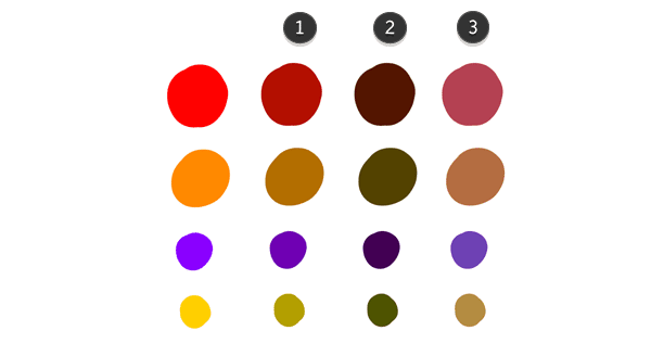
Intermediate light (several degrees darker, bluish)
Shadows (darker, bluer)
Reflective light (slightly brighter than the “intermediate light” color, but more bluish and less saturated)
Forget about the cumbersome Photoshop color palette, let’s start coloring with our chosen colors!
Step 1
Cover the object with a layer of shadow (the darkest color you’ve picked).

Step 2
Use intermediate light colors to fill all the main arrays of the puzzle (don’t paint the boundaries between the arrays).

Step 3
Use primary colors to paint areas that catch direct light.

Step 4
Use reflective colors to paint faces facing the light source.

Step 5
Complete the drawing. Now you can add a few other colors to your liking, but it’s best to follow the main gamut of the drawing, don’t use “fluff” colors with the entire color scheme you’ve built.
As you can see, creating color palettes right from the start makes drawing faster and more convenient. You can also easily try out different color combinations before spending time and effort on details.

3. Imitate colors from reality
Professionals often say: “Photographs are not a good source of reference, use facts to learn more.” This method of learning is accurate, yet they rarely mention its difficulty.
For example, say you want to draw a realistic object. And when we start coloring, we consider the specimen to be a system of many different colors. So where to start now, which color to choose before? Because the color of the specimen appears to change continuously on its surface. For better understanding, try using the Eyedropper tool in photoshop (press shortcut I), and selecting different places in the pattern that you think are “the same color”, you will be extremely confused when you see the parameters. The colors on the palette change continuously, for which each parameter corresponds to a different color. That’s strange, right, since where you think it is black, it’s actually a tinge of blue, and the human skin color you choose could be a combination of green and purple. You multiply your eyes have deceived you! It is an easy consequence if you draw the pattern in the picture,and use the Eyedropper to pick the colors.
So let’s practice another more effective method later: using the eyes.
Step 1
Use a neutral (ivory white) cardboard board. Take scissors to cut square holes on it, one hole about 10mm, one hole 5mm.

Step 2
Find a drawing pattern.

Step 3
Use a board to separate the colors you choose from the whole. Then try to pick the correct color in Photoshop. (close one eye to make it easier). Use large holes in the cover for large colored areas, and small holes for small areas. You can use both holes to compare the gradations.

Let’s start with the colors that are most present in the scene (primary colors). Once you’ve identified them, you probably won’t need the cover anymore, your eyes now have the support you need and will make more precise color adjustments.

This may be difficult at first, but over time you will improve in color vision and will no longer need the color separator card. This exercise is the best way to learn about colors and their correlations. Instead of having to depend on the eyedrop tool to pick a color, you can decide for yourself how to use the color most closely resembles the pattern.
After you complete this exercise, you will notice the colors of the world around you as a habit. This is a very interesting and necessary experience for the artist.

Author: Monika Zagraobelna


